Recently a friend asked me to read the draft of his book he planned to self-publish. He wasn't looking for feedback, he said; he just wanted meto read it. He insisted it would only take two or three hours. Wanting to lower his expectations, I assured him I was a slow reader.
A week later he asked what page I was on. Only about page 20, I told him, but it's really good so far. And it was. The next time I ran into him, he asked again. I fumbled for an answer, having made little progress. Then, yesterday, I was out walking my kids, pushing our heavy double stroller when I ran into him. He says to me, no lie, "Have you finished my book yet? It's been 50 days."
At this point, I've got to say, I really don't feel like reading his book anymore.
My friend had a motivated reader. I had every intention of finishing his book. And somewhere in the gap between intention and the right conditions, the motivation dissolved.
That's what a product page can do to a ready buyer.
There's a moment in every shopping session where the sale is either won or surrendered. Not at checkout, not in the cart, but on the product page. That's the highest-intent moment in your funnel. Someone who already found you, already clicked through, already cares enough to look, and now they're deciding. Baymard Institute, which has spent over 200,000 hours researching ecommerce UX, is clear on this: nearly every user passes through a product page before making a purchase decision.
Here's what makes that significant. Baymard's 2025 benchmark found that 51% of leading US and European ecommerce sites have "mediocre" or worse product page UX. And not one got a perfect score. Not small shops, established stores with real traffic and real budgets. The gap between stores that convert and stores that don't usually isn't traffic or pricing. It's the product page, and whether it was built with intention or just shipped with the theme defaults.
Here's what actually separates them.
Hierarchy does the heavy lifting before the shopper knows it
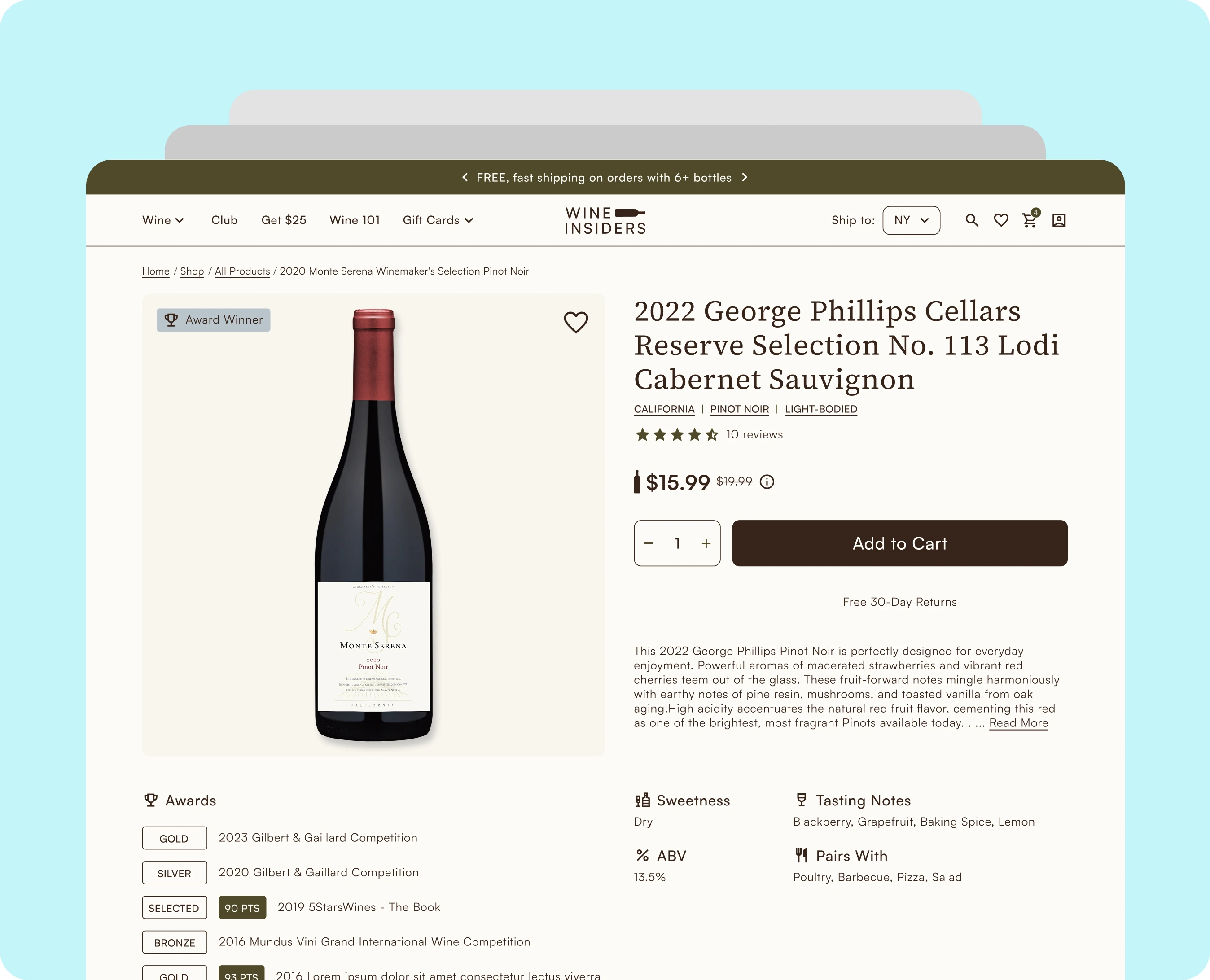
When someone lands on a product page, they're scanning, not reading. Visual hierarchy controls what they see first and in what order. A well-structured page earns the decision — it leads with what the shopper came to see, layers in what they need to feel confident, and delivers the CTA at the natural moment. When hierarchy breaks, shoppers feel friction they can't name, and they leave. Common failures: pricing below the fold, variant selectors disconnected from imagery, secondary content crowding the action zone before the shopper has even decided they want the product.
Trust signals answer questions shoppers never ask out loud
Before adding to cart, shoppers run a quiet checklist. Is this site legitimate? Is my card safe? They're not asking these questions out loud, but they're asking them — and if the page doesn't answer them, doubt wins. Baymard found that 18% of US shoppers have abandoned a checkout solely because they didn't trust the site with their credit card information. Placement matters as much as presence. A return policy near the Add to Cart button lands differently than one buried in the footer. Real customer photos answer questions that polished studio imagery often can't.
Mobile is where most of your traffic is, and where most stores underperform
Mobile drives around 78% of global ecommerce traffic. The average mobile CVR sits at roughly 2.85% versus desktop's 3.85%. That gap is a design problem, not a device problem. "Works on mobile" because it's responsive isn't the bar; responsive means it renders. Mobile shoppers navigate with a thumb, in distracted contexts, on screens that amplify every friction point. With mobile projected to account for 59% of all global online retail sales in 2025, this isn't something to revisit later.
Imagery is the closest thing to holding the product
Your images do the work a physical store does naturally. Most stores have a primary image. Fewer have multiple angles, lifestyle context, scale references, and variant-specific photos that update when a shopper makes a selection. When someone picks "Forest Green" and the photo stays on "White," that uncertainty is a conversion killer. Real customer photos carry particular weight. Authentic context removes doubt in a way polished photography often can't.
The CTA is a designed decision, not a default
The Add to Cart button is the most important single element on the page, and most stores have never consciously made a decision about it. The label, the placement, the surrounding context, whatever the theme shipped with. Shopify Plus opens up real flexibility here: custom checkout flows, persistent cart elements, accelerated options like Shop Pay and Apple Pay. But platform capability only matters if the design decision has been made first.
What this adds up to
A product page that converts isn't one thing done right. It's these five dimensions (hierarchy, trust signals, mobile, imagery, and CTA) working as a system. That's the lens we bring to Shopify Plus clients. Not a patch list, but a clear-eyed look at how the page functions as a whole and where the friction actually lives.
My friend still hasn't gotten me to finish his book. Not for lack of caring, but the conditions just never came together. A ready shopper on the wrong product page ends up in the same place.
If you want to dig into how your product page holds up, we're happy to take a look.
Sources:
Baymard Institute Product Page UX Benchmark 2025; Baymard Institute Checkout Usability Research; Monetate / Oberlo mobile ecommerce conversion data 2024; Venn Apps mobile commerce projections 2025.